AnchorEmpowering UMSI students to achieve career success.
Duration
Role
Team
Tools
3.5 months
UX Researcher & Designer
3 UX Designers
Figma · FigJam
A centralized career platform for the University of Michigan School of Information — reorganizing fragmented job boards, mentorship, and events into one tool tailored to how UMSI students actually search.
UMSI students described their career search as “juggling six tabs and missing all the deadlines.” We interviewed 8 students across diverse academic tracks, mapped their journey end-to-end, and consolidated UMSI's scattered career resources into one prototype. In testing, 85% reported reduced cognitive load and 75% said the mentorship feature meaningfully improved networking. The win wasn't the screens — it was the shared map of why the experience felt broken.
01 · Problem statement
The problem
How might we leverage and reorganize UMSI's resources and network to increase the success rate of finding internships and post-graduate opportunities — while decreasing the cognitive load for overwhelmed students?
02 · The challenge
A career search that lives in six tabs
Participant insight · U3
"Resources such as job boards, career events, and mentorship programs are scattered across multiple platforms, creating a fragmented and inefficient system."
UMSI students don't lack resources — they lack a coherent way to find, sequence, and trust the ones already available to them. Handshake, the UMSI Slack, the Engaged Learning newsletter, individual office emails, Iris alumni search, peer Google Docs: each is useful in isolation, but together they form a maze that disproportionately punishes students with less social capital and less time.
6+
Tools per search
Students reported actively using six or more platforms during a typical week of job searching.
8/8
Feel "behind"
Every interview participant described a constant background feeling of being behind on something.
Once
Resource use
Multiple participants said they'd only used UMSI's career resources once — during first-year orientation.
2/8
Used mentorship
Only 2 of 8 had ever reached out to a UMSI alum, despite all of them naming mentorship as critical.
03 · Approach
A double-diamond process built for a tight semester
Anchor ran on a compressed 12-week academic timeline, so the team designed the process around three forcing functions: every research artifact had to inform a design decision, every design decision had to be testable, and every test had to feed back into a single shared source of truth.
Discover
Wks 1–3
Secondary research, stakeholder context with UMSI offices, competitive scan of Handshake, CareerLink, and peer platforms.
Define
Wks 4–5
8 student interviews across diverse MSI tracks, affinity mapping, journey mapping, persona development, problem-statement workshops.
Usability testing with 8 students, peer critique, iteration, final prototype, report, and stakeholder readout.
04 · Methodology
Methods
We used a mixed-methods approach — qualitative interviews to surface the lived experience, and structured usability protocols to validate the design once it took shape.
01
Stakeholder Interviews
Conversations with Engaged Learning, Career Development, and DEI offices to understand each surface students touch.
3 offices · 5 staff
02
Semi-structured Interviews
8 UMSI students across MSI tracks (MHI, Big Data, Agile Development, LAKES) screened for varied career stages and visa status. Conducted over Zoom, recorded with Loom.
8 students · 15–20 min each
03
Affinity Mapping
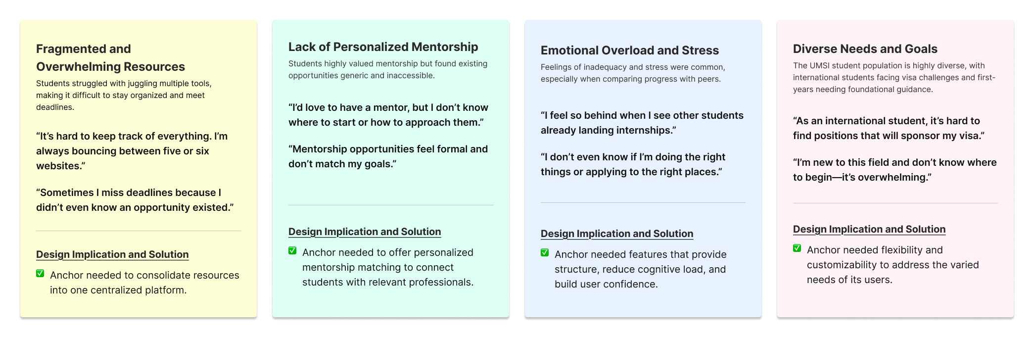
Quote-level observations clustered into four primary themes that anchored the design phase: fragmentation, mentorship opacity, visa invisibility, cognitive overload.
4 themes surfaced
04
Journey Mapping
Current-state map across five stages of the search, with emotion overlays and pain-point tagging.
5 stages · 18 pain points
05
Competitive Analysis
Audit of Handshake, CareerLink, LinkedIn, Iris (alumni), and peer-school platforms — what each does and where it breaks for UMSI's audience.
5 platforms scored
06
Usability Testing
Moderated tests with 8 students using a written protocol, two core flows, and a post-task SUS survey.
8 participants · 60 min
05 · Research findings
Four themes that shaped everything
The affinity work consolidated into four themes that became the design team's shared vocabulary for the rest of the semester. Every screen, every interaction, every cut had to trace back to one of these.
Theme 01
Fragmentation
Students described "knowing where everything lives" as a survival skill — and one that disproportionately advantages students with existing networks or institutional fluency.
"I find the UMSI resources difficult to navigate."
— Interview participant
Theme 02
Mentorship opacity
Every student named mentorship as critical, but only two had ever messaged an alum. Blockers were rarely interest — they were knowing who to ask, how, and how much was reasonable to ask for.
"I try and find alumni with similar career trajectories so I can follow their footsteps."
— Interview participant
Theme 03
Visa & identity invisibility
International students did meaningful additional work to filter sponsoring employers — most of it manual, much of it duplicated across friends. None of the existing UMSI tools surfaced sponsorship status reliably.
"I read the careers page three times before I gave up and asked another student."
— International student participant
Theme 04
Resource avoidance
Beyond fragmentation, students described a constant background hum of "am I missing something?" — and then avoided UMSI's tools altogether after early failed attempts to use them.
"Last time I used UMSI career resources was when they first introduced them to us during orientation."
— Interview participant
Fig. 1 · Affinity-mapped interview themes from 14 student interviews
06 · Personas
Who we designed for
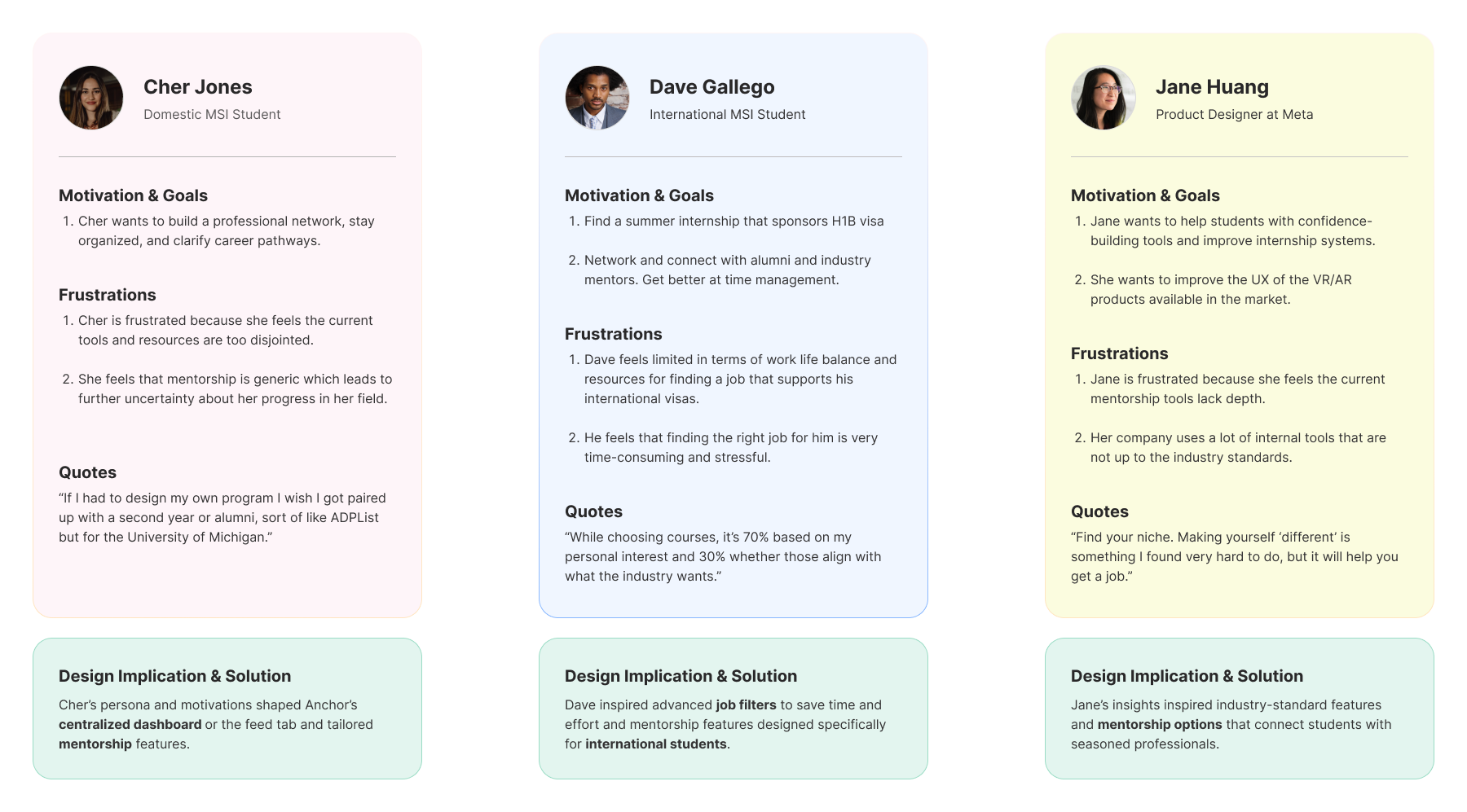
Three personas captured the most common UMSI career-search modes. They were the team's tie-breaker tool — every contested design decision had to be defensible against at least two of these three.
CJ
Cher Jones, 25
Domestic · MSI · UX track
Goals
Build a professional network, stay organized, and clarify career pathways into UX.
Frustrations
Disjointed resources, generic mentorship opportunities, and uncertainty about her progress.
Design implication
Cher's persona shaped Anchor's centralized dashboard and tailored mentorship features.
DG
Dave Gallego, 27
International · MSI · Data Analysis
Goals
Secure visa-sponsored roles, connect with mentors, and manage limited time effectively.
Frustrations
Generic job boards, intimidating networking processes, and time constraints around OPT.
Design implication
Dave inspired advanced job filters and mentorship features designed for international students.
JH
Jane Huang, 29
Alumna · MSI · Product Designer @ Meta
Goals
Support students with confidence-building tools and improve the internship pipeline.
Frustrations
Existing internship tools and mentorship opportunities lack depth and continuity.
Design implication
Jane's insights inspired industry-standard features and ongoing mentorship rather than one-off coffee chats.
Fig. 2 · Full persona spread (final report)
07 · Journey map
The current state, mapped
We mapped the typical UMSI career search across five stages. Each stage surfaces what students actually do, the tools they reach for, the emotional state they're in, and the design opportunities Anchor took on.
Discover"What is even out there?"
Evaluate"Is this for me?"
Prepare"How do I apply?"
Connect"Who can help?"
Decide"What do I do next?"
Actions
Tools
Pain points
Emotion
Opportunity
Browse listings, skim newsletters, check Slack channels at random hours.
Handshake, Slack, UMSI office emails, peer Google Docs.
Doesn't know if a posting is real, current, or right for UMSI students.
Curious / scattered
A single feed surfacing UMSI-curated roles, with sponsorship labels.
Compare 3–5 roles, ask peers if a company is "good."
LinkedIn, Glassdoor, friend group chats.
No UMSI-specific signal — alum testimonials are buried or absent.
Uncertain
Referral pages with alum context: who's worked there, what they hire for.
Tailor resume, write cover letter, prep for one or two upcoming events.
Resume drafts, Google Calendar, scattered RSVPs.
Events live in 3+ office calendars; deadlines slip through.
Anxious
Unified events surface with built-in calendar integration.
Try to find alums; over-think the cold email; usually give up.
Iris alumni search, LinkedIn DMs, asking friends.
No social proof; no "low-friction" way to start a conversation.
Hesitant
Mentorship requests with peer-rated alum helpfulness and templates.
Track offers, talk through tradeoffs with mentors and peers.
Spreadsheets, Notion, 1:1 chats.
No single surface to weigh tradeoffs; "saved" jobs disappear.
Hopeful but tired
Saved-jobs & saved-mentors persistence across the platform.
08 · From insight to design
Reframing the problem
The four themes and journey map pointed at one underlying truth: UMSI doesn't have a discovery problem, it has a coherence problem. The resources are already there. We re-stated the brief as a How Might We to keep the design conversations grounded in that distinction.
How might we
…design a single, trustworthy surface that lets a UMSI student see what's available, who can help, and what to do next — without ever leaving the page?
Design principles
To keep an opinionated team aligned across four parallel workstreams, we agreed on three design principles up front. Every screen review used these as the rubric.
01
Trustworthy by default
If Anchor surfaces a role, event, or alum, students should believe it's been vetted for UMSI fit. Quiet authority beats loud marketing.
02
Lower the activation cost
Every "first action" — first message, first RSVP, first save — should take fewer than three taps and one minute.
03
Respect the search
Students are not casual users. Anchor optimizes for repeat, focused sessions — not engagement metrics or notification load.
09 · Goals & objectives
What success looked like
01
Centralization
Combine job boards, career events, and mentorship into one platform — eliminating tab-juggling across UMSI tools while preserving the office-by-office context where it matters.
02
Personalization
Mentorship matching and filters for visa sponsorship, role type, and student-rated mentor helpfulness — making invisible information visible.
03
Guidance
Reduce cognitive load with streamlined navigation, clearly defined pathways for each user action, and consistent visual language across every flow.
10 · Information architecture
From sketch to system
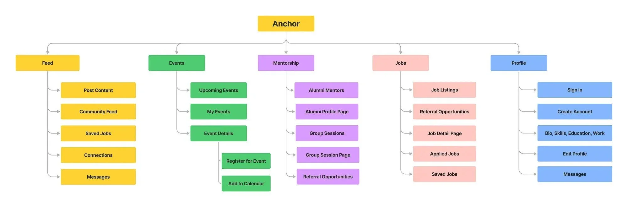
The IA reorganized UMSI's existing resources around three primary hubs — Feed, Events, and Jobs — with a mentorship layer that connects students to alumni through every surface, not as a standalone tab.
Fig. 3a · Information architectureFig. 3b · Key features & cross-links
User flows
Before building screens, we mapped 11 end-to-end user flows across the four primary surfaces. Each flow traces a single intent — sign in, RSVP to a session, send a mentor request, cancel a registration, save a job — from entry to confirmation, with explicit error-prevention states for cancellation flows.
Fig. 3c · The 11 user-flow diagrams that anchored design decisions before pixels
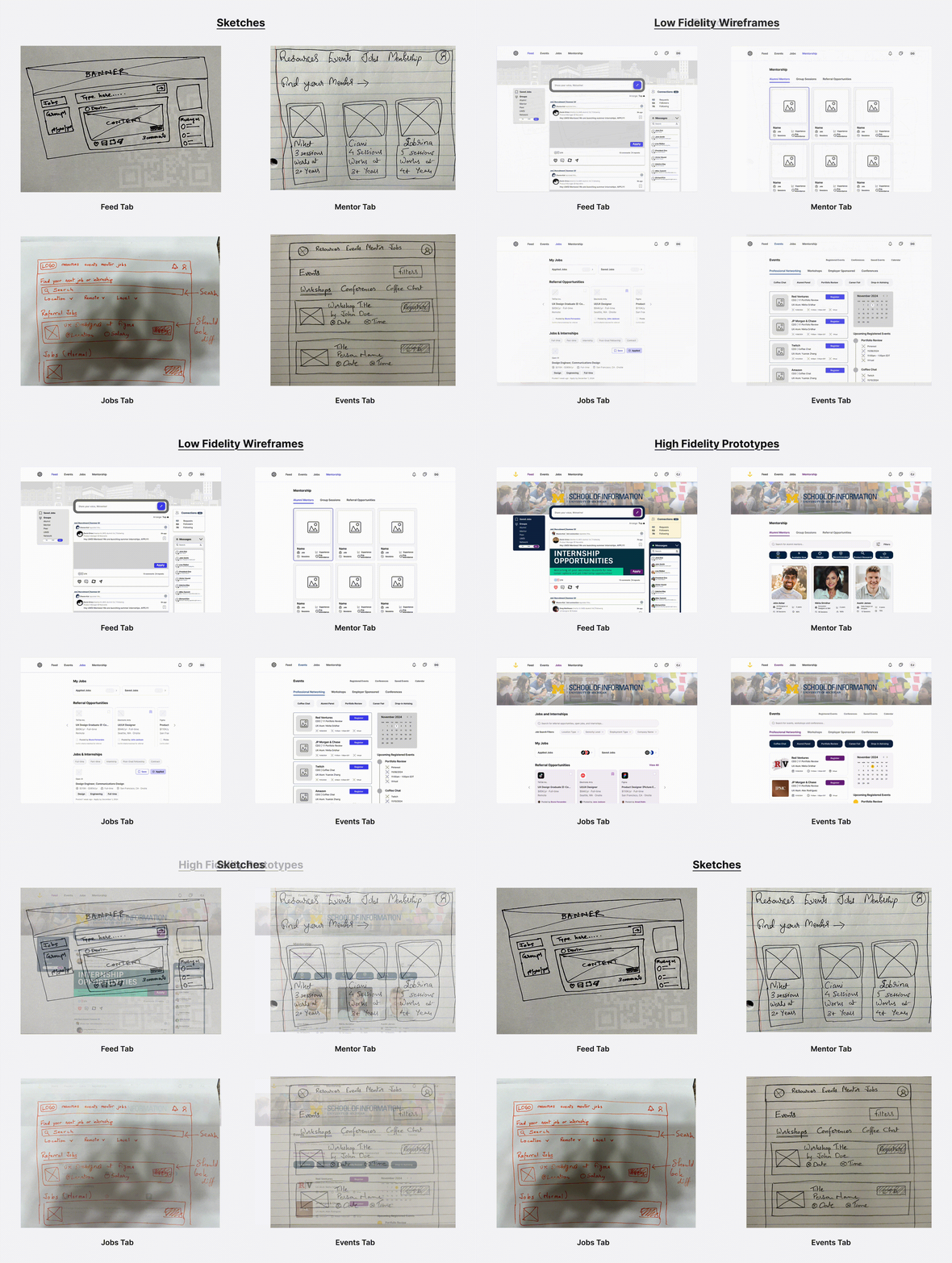
Wireframe → Hi-fi progression
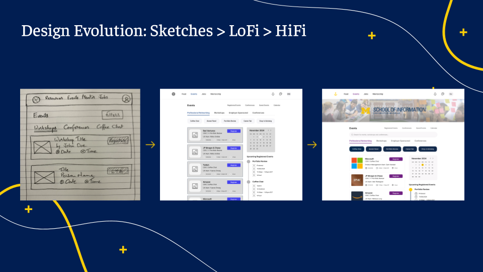
We worked in three deliberate stages, validating with peers between each. Holding off on visual polish until the third stage kept critique focused on flow and clarity, not aesthetics.
Stage 01
Hand sketches
Pen-on-paper sketches per primary tab (Feed, Mentor, Jobs, Events). Layout decisions made fast, before any pixel got pushed.
Stage 02
Low-fi wireframes
Grayscale Figma frames testing IA, button hierarchy, and content density across all four tabs. Validated in the first round of usability testing.
Stage 03
Hi-fidelity prototypes
Branded Anchor screens with the UMich navy/maize system, real strings, photography, and full interactive prototype wiring.
Fig. 4a · Hand sketches across all four primary tabsFig. 4b · Low-fidelity wireframes for the same four tabsFig. 4c · High-fidelity prototypes — final design system appliedFig. 5 · Anchor end-to-end system overview
Design system
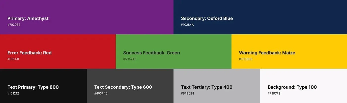
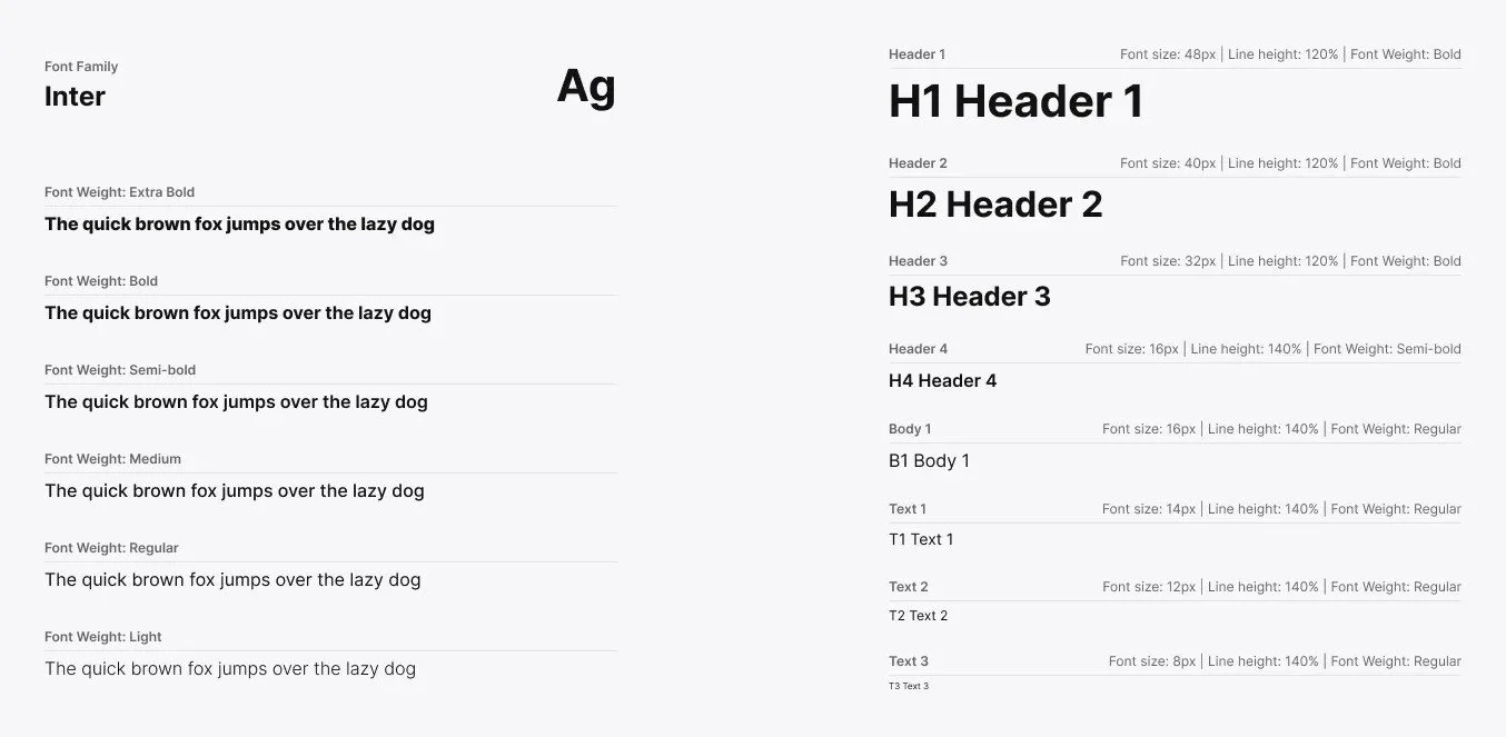
Anchor's visual language leans into Michigan's identity — navy authority, maize energy — paired with a quieter Mulish/Fraunces type system that lets the content lead.
Color
Navy #00274C
Maize #FFCB05
Paper #F5EFE0
Ink #2E2438
Color-blindness-friendly contrast pairs informed every primary/secondary combination.
Type
AaMulish · Display
Spacing
Fig. 5a · Anchor color palette (accessibility-checked)Fig. 5b · Anchor type system
11 · Design walkthrough
Four flows, one platform
Surface 01 · Feed
A career home that doesn't feel like LinkedIn
The Feed is a low-pressure hub for students to connect with peers and alumni, see referral posts, and share milestones as they progress through the year.
Designed for UMSI's culture, not retrofitted from a generic professional network — every component asks the question, "Would a UMSI student feel comfortable posting this?"
Lightweight posting — no recruiter-bait formatting, no engagement metrics in students' faces
Cross-links everywhere — every post can jump to its job, event, or mentor in one tap
Live
Surface 02 · Events
One calendar across three offices
The Events surface unifies the Engaged Learning, Career Development, and DEI office calendars into a single, filterable view — with a built-in scheduler so students don't have to leave Anchor to RSVP or track an upcoming session.
Tagging events by office keeps each program's identity intact while removing the cost of knowing which office hosts what.
Office filters as a default, not a hidden setting
Personal calendar auto-syncs accepted events to Google Calendar
"Why it's relevant" blurb for every event, written by the hosting office
Live
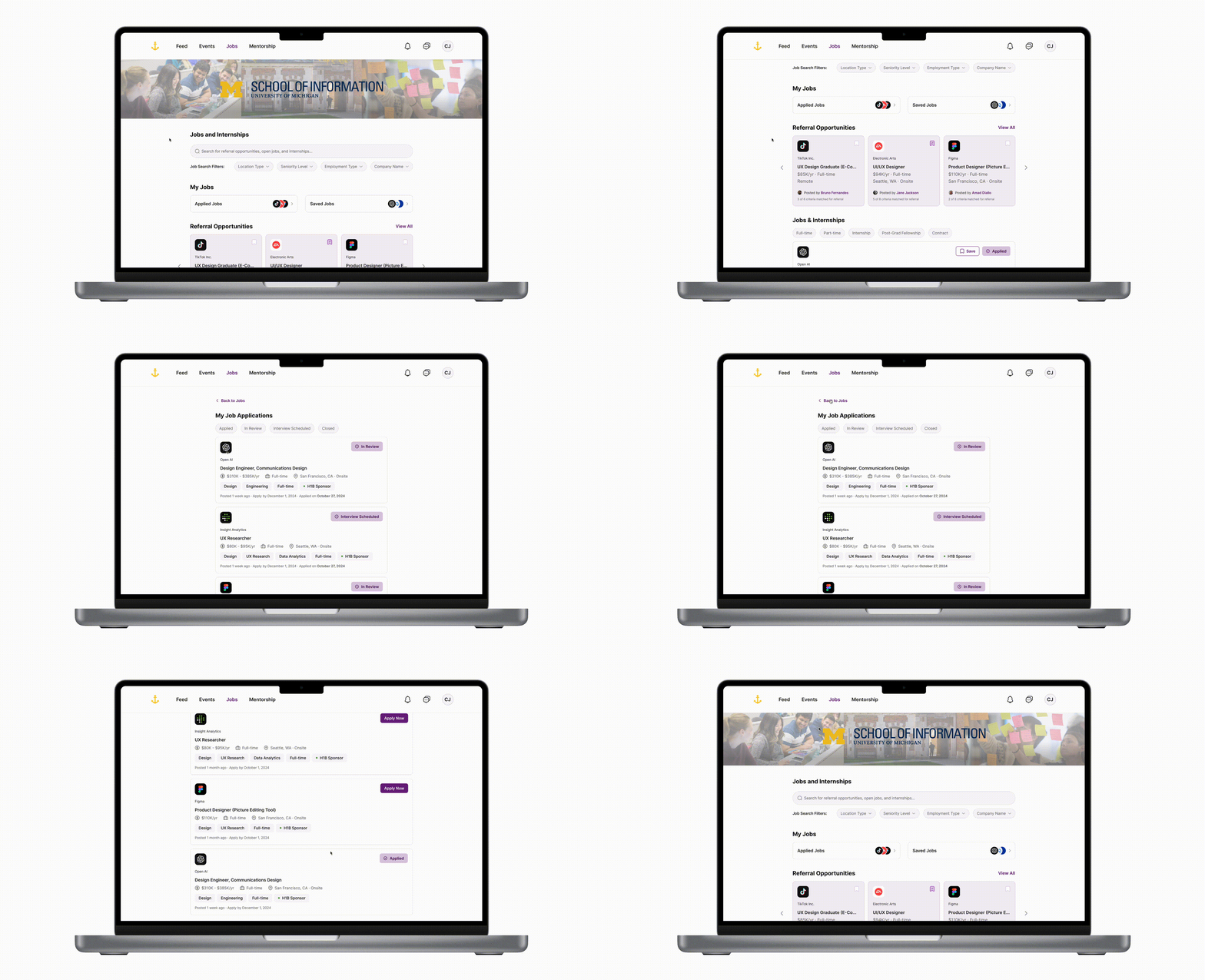
Surface 03 · Jobs & referrals
UMSI-curated postings, visa-aware filtering
The Jobs page surfaces internships and full-time roles relevant to UMSI students — Product Designer, Data Analyst, Design Engineer, UX Researcher. The referrals view highlights what a hiring manager is actually looking for: required major, project experience, and coursework, so students can self-screen before they apply.
Sponsorship signal on every card, not buried in a description
UMSI alum-at-company badge wherever it applies
"What they look for" structured field per referral
Live
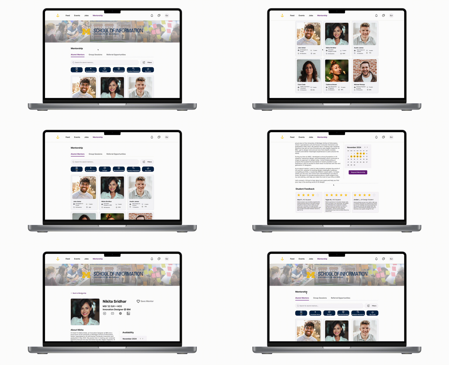
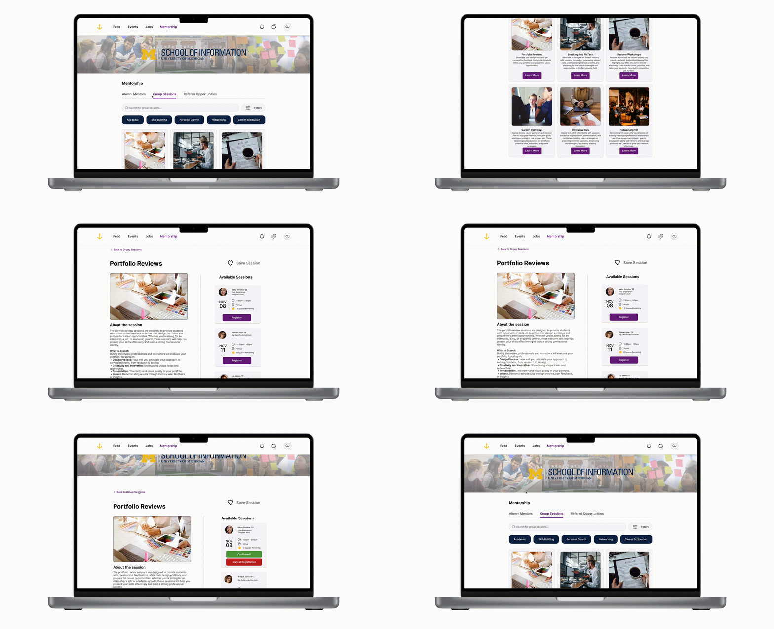
Surface 04 · Mentorship
An alumni network that's actually usable
Michigan's alumni base is enormous but historically hard to navigate. The Mentorship flow lets students filter alumni by career goals, read peer-rated helpfulness, send a request using a starter template, and book a meeting directly — turning a passive network into an active one.
Peer-rated helpfulness as the primary signal, above title or company
Starter templates remove the blank-page problem from cold outreach
Scheduling baked in — no calendar tag, no email tennis
Live
💡 Simplicity and flow: By prioritizing Nielsen Norman's principles of visibility and consistency, every surface was built around clearly defined pathways for each user action — never more than three taps to a first useful state.
Feed
Maya posted a referral · Google UX
Events
Resume review Tue 4 pm · EL Office
Jobs
Product Designer Stripe · 2 UMSI alum
Mentor
Maya R. · Stripe ★ 4.9 · 12 sessions
Feed
Maya posted a referral · Google UX
Events
Resume review Tue 4 pm · EL Office
Jobs
Product Designer Stripe · 2 UMSI alum
Mentor
Maya R. · Stripe ★ 4.9 · 12 sessions
Four flows · one platform
One Anchor.
11b · Key features in motion
Three features doing the heavy lifting
Three flows did most of the work to make Anchor feel different from CareerLink or Handshake. Each came directly out of an interview insight and was validated through usability testing.
Feature 01
Mentorship Dashboard
A formal mentorship program rather than a one-off coffee chat. Alumni profiles include customizable expectations for mentees — relevant coursework, projects, or skills — so students can align their goals with industry demand before they even reach out.
Ongoing relationships instead of single touchpoints
Transparent alum expectations per profile
Goal alignment built into the matching flow
Mentorship Dashboard · live prototype
Feature 02
Group Mentoring Sessions
Group mentoring sessions, real-time chat, and asynchronous message boards — designed in response to feedback that the career search felt isolating. Inclusive of varying schedules and communication preferences.
Live and async formats side by side
Networking flexibility participants explicitly asked for
Lower-pressure entry into alumni conversations
Group Mentoring Sessions · live prototype
Feature 03
Application Tracker
A single surface for tracking deadlines, application statuses, and employer feedback — consolidating what CareerLink and Handshake forced students to do across separate logins. Timeline structures and reminders are tuned to internship cycles.
One source of truth for every active application
Cycle-aware reminders for tech-industry timelines
Status + feedback captured per application
Application Tracker · live prototype
12 · Iteration
What changed between v1 and v2
Testing surfaced two design decisions that we'd convinced ourselves were "obvious enough" — and weren't. Both got rewritten before the final stakeholder readout.
v1 · Before
Static Resources tab
The home was a static "resources" page — a tab students described as opaque and difficult to navigate. Resource use dropped off after orientation.
v2 · After
Dynamic Feed tab
Replaced with a social-feed format surfacing primary, secondary, and tertiary connections. Borrowed familiar patterns (Jakob's Law) to lift retention and daily active use.
v1 · Before
Long job list, no search
Users disliked scrolling through long job lists with no way to narrow them down to UMSI-relevant roles.
v2 · After
Prominent search + advanced filters
Added a search bar and filters tuned for UMSI students — leveraging Hick's Law and selective attention to reduce cognitive load and improve click-through.
v1 · Before
Referrals buried under Jobs
Conceptually clean — but users repeatedly missed the section and described referrals as "a thing I heard about but couldn't find."
v2 · After
Redesigned Referral Cards
Promoted referrals to their own surface with a "what they look for" structured field on every card — required major, project experience, coursework.
Fig. 6 · Animated before/after of the v1 → v2 design iterations
13 · Usability testing
Validating the design
We tested with 8 UMSI students recruited across MSI tracks (MHI, Big Data, Agile Development, LAKES). Sessions ran 15–20 minutes over Zoom, recorded with Loom; one in-person session was also captured. Participants worked through tasks against low-fi Figma prototypes.
Tasks covered
01
Finding and connecting with a mentor
Filtering alumni, reviewing peer-rated helpfulness, and sending a request.
02
Registering for events or group sessions
Locating the right office's events and RSVPing in-platform.
03
Applying for jobs through alumni referrals
Navigating from a referral card to an application with the right context.
04
Saving jobs and updating skills
Maintaining a persistent shortlist and a profile that mentors could actually act on.
We tracked error rates, success rates, and time on task, then ran a short post-session interview to surface the why behind each metric.
Tasks
Two core flows
Find a saved job posting from the Feed and book a mentorship session with an alum. Designed to stress both navigation and trust-building.
Positive findings
"Anchor feels like the tool I've always needed."
Students universally appreciated the centralized platform and reported that mentorship felt approachable for the first time.
Improvement areas
Clearer referrals labeling
Some users struggled with the referrals section and requested clearer terminology — addressed in the v2 iteration described above.
Outcome: The final iteration incorporated streamlined navigation, enhanced filters, and improved mentorship workflows — directly addressing the friction we surfaced in testing.
14 · Impact
What changed for students
85%
of participants reported reduced cognitive load when navigating their career search.
75%
found the mentorship feature significantly improved their networking experience.
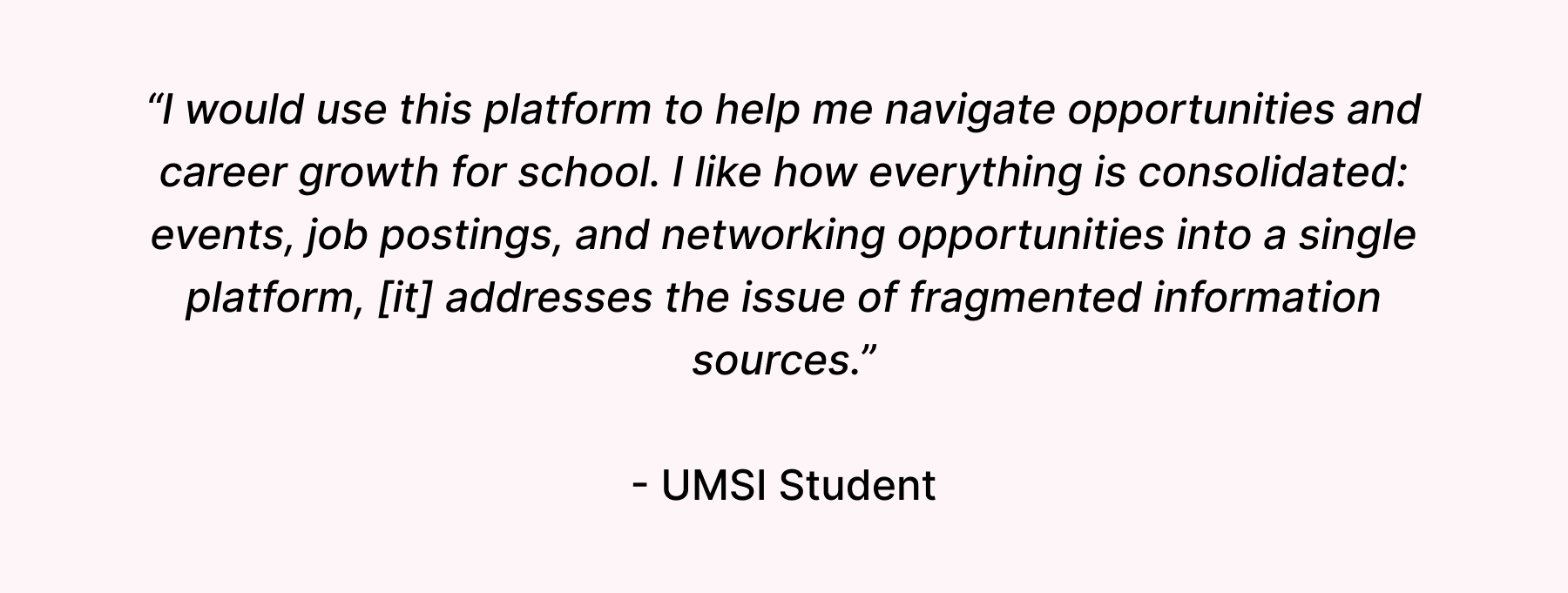
In their words
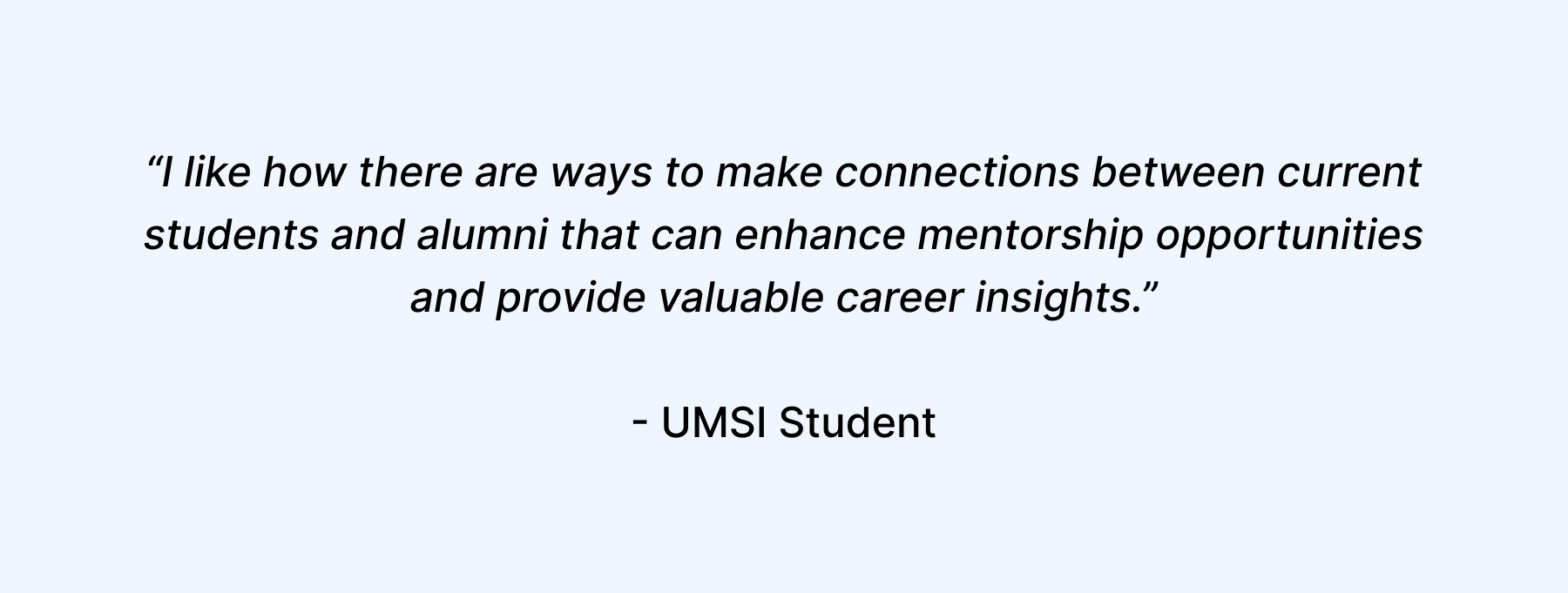
Two of the testimonials we received from UMSI students during testing and post-readout sharing:
student interviews across MSI, BSI, and PhD programs.
3
UMSI offices interviewed at the stakeholder level.
8
usability testers across two core flows.
2
major iterations driven directly by user feedback.
15 · Prototype
Full interactive prototype
The complete case-study prototype is embedded below — click through to test sign-up, Feed posting, event RSVPs, job applications, and mentor requests end-to-end. Error-prevention modals for cancellation flows are wired in.
16 · Looking forward
What I would do next
Partner with UMSI Career Development to pilot the Feed and Mentorship surfaces with a single cohort for one semester.
Layer in international-student-specific guidance — visa timelines, OPT-aware filters, and policy-change alerts in the Feed.
Stress-test the referrals flow with hiring-manager interviews on the other side of the platform — what do alums actually want from the experience?
Explore federation with non-UMSI Michigan schools without losing the curation that makes Anchor trustworthy in the first place.
Build a quiet recommendation layer that surfaces "next action" prompts based on stage in the journey, not engagement metrics.
What I learned as a researcher
Centralization isn't a feature — it's a service-design problem about trust, ownership, and the existing campus tools you're competing with.
Students described "cognitive load" before I introduced the term; the affinity work has to listen for participants' language, not impose ours.
Mentorship works when it's frictionless to start, not when it's heavily structured upfront. Templates beat policies.
Quantitative validation (85% / 75%) only carried weight because the qualitative work behind it was rigorous and traceable.
The hardest deliverable to write was the one-paragraph stakeholder summary. If you can't say it in three sentences, you don't understand it yet.
💡 Reflection
Anchor was my first client-facing UX research engagement, and it taught me that the real deliverable wasn't the prototype — it was the shared model of why UMSI's career experience felt fractured. Once stakeholders saw the friction mapped end-to-end, the design decisions became almost self-evident.
I left this project more confident that good research design upstream lets the visual design downstream be quiet and obvious. The next time I take on a project this complex, I'll spend more time on the front end — building the journey map and design principles together with stakeholders, not for them — and less time defending screens.