0%
Designing intelligent text-entry tools so that multilingual researchers can read, write, and reason with generative AI in their language of choice — without losing nuance, accuracy, or authority.
26% faster translation · ↓ NASA-TLX cognitive load · n=15 within-subject study
The University of Michigan's academic departments represent over 150 countries.
Our study reached researchers fluent in Chinese, Korean, Hindi, Urdu, Burmese, Macedonian, Persian, and more, the exact population a tool like Rosetta is built to serve.
The generative AI tools these researchers reach for every day, ChatGPT, Gemini, and their peers, are trained and tuned overwhelmingly for English. So a scholar who thinks in Hindi or Burmese ends up translating their idea into English, prompting, then translating the answer back, losing nuance, time, and trust at every step. This study asks a simple question: what would it take for the interface to meet multilingual researchers where they already are? The map below isn't decoration, it's the user base, and the gap between it and an English-first AI is exactly the problem Rosetta sets out to close.
CSE 593 graduate HCI research at the University of Michigan. Five researchers studying equity in generative AI for non-native English speakers in academic workflows — literature review, academic writing, brainstorming.
ChatGPT and peers are trained and tuned for English. Multilingual researchers constantly translate, code-mix, and re-prompt — losing nuance, time, and trust in the output. The interface, not the model, is the lever we have.
Rosetta — a Gemini-powered chat assistant with a highlight-popup tooltip for Simplify, Tone Match, and Translate. A within-subject study (n=15) showed statistically significant gains in completion time and lower NASA-TLX workload.
A 16-week HCI research project producing Rosetta: a Gemini-powered chat assistant with a highlight-popup tooltip that lets multilingual researchers Simplify, Tone Match, and Translate any AI response in place — measurably faster and lower-effort in a controlled within-subject study.
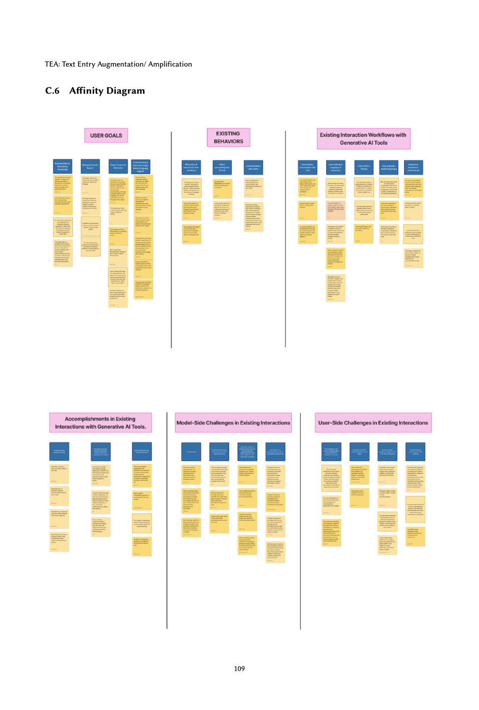
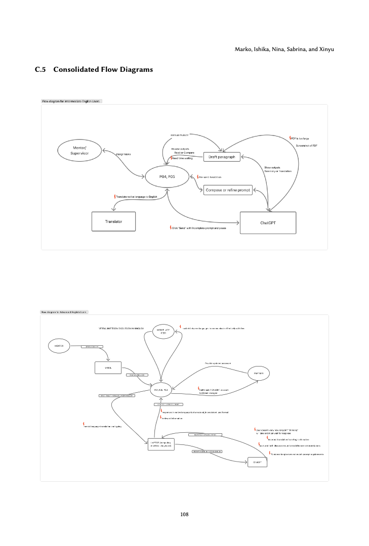
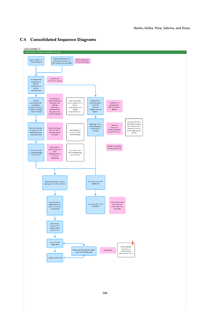
Through a survey of 24 multilingual researchers and contextual inquiries with 5 graduate participants across Chinese, Hindi, Urdu, Burmese, Croatian, and Italian native languages, we identified three interconnected challenges that current AI tools fail to address. These obstacles compound each other, creating a persistent barrier to equitable access for non-native English speakers in academic research contexts.
Generative AI models perform significantly better with English prompts, disadvantaging multilingual users who think in other languages.
Constant translation between thinking language and English input creates mental overhead and disrupts research flow.
AI responses can alter intended meaning or tone in ways that are difficult for non-native speakers to detect and correct.
Three questions framed the field work. Each survey item, contextual inquiry session, and prototype iteration laddered back to one of them.
How do multilingual researchers currently formulate prompts, articulate intent, and recover from breakdowns when generative AI defaults to English?
What strategies do they adopt — code-switching, manual rephrasing, translation cross-checks — and where do those strategies break down in real research workflows?
Can a lightweight, post-generation text-entry layer measurably reduce task time and cognitive load without retraining the underlying model?
We ran two arcs: a qualitative research arc to ground the design in real bilingual practice, and a quantitative evaluation arc to measure whether the resulting interaction held up against a baseline.
Five multilingual graduate researchers, recruited across the team's networks. Sessions ran 45–75 minutes in person or over Zoom while participants used ChatGPT or Gemini on a real research task they were already mid-way through (lit review, paper writing, debugging a method section).
| ID | Native lang. | English | Role | AI tasks (text entry) | Mode |
|---|---|---|---|---|---|
| P1 | Chinese | Intermediate (7/10) | Grad student, Data Science | Paragraph polishing | Zoom · ~50m |
| P2 | Korean | Fluent | Humanities grad student | Summarization, translation, tone control; screenshot workaround | In-person · ~45m |
| P3 | Hindi | Fluent bilingual | Software developer / researcher | Idea drafting, literature check, Hinglish → English typing | Zoom · ~45m |
| P4 | Macedonian | Fluent | Professor | Summarization, translation | Google Meet · ~50m |
| P5 | Chinese | Fluent | Master's student | Paper reading | In-person · ~120m |
Synthesizing across the contextual inquiries, we composed a single anchor persona to keep design conversations grounded. Every prototype decision had to make sense for Emma — a fluent-bilingual graduate researcher under deadline pressure.
"I want to think in my language and have the AI meet me there — not constantly reformat my own ideas just to be understood."
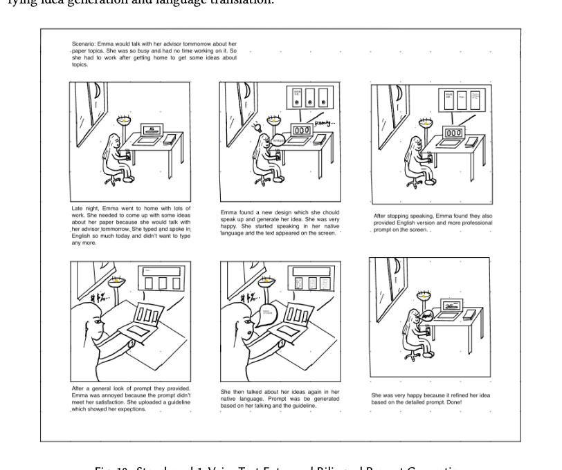
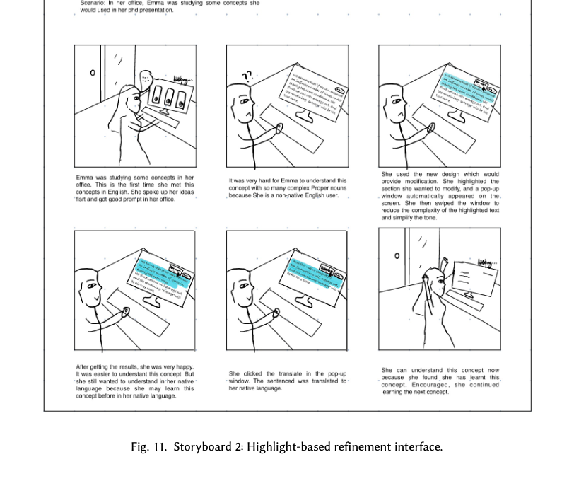
Two storyboards translated Emma's frustrations into concrete moments. Both anchored later prototype decisions and were used to align the five-person team on which interactions to build first.
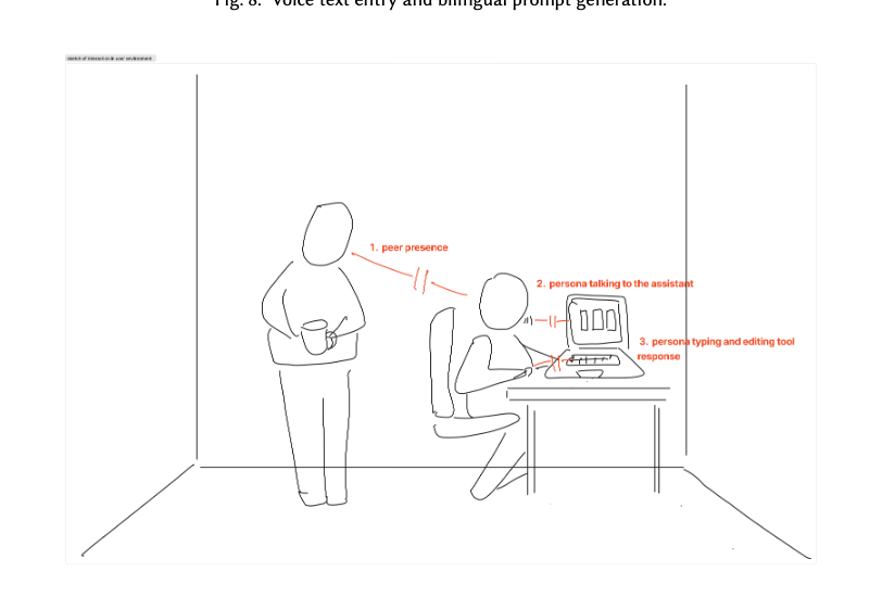
Late at night, Emma is too drained to type in English. She speaks her ideas in her native language; the system transcribes, translates, and offers a more professional English prompt back. If the prompt misses her intent, she uploads her own writing guidelines so the system can match her voice.
While studying complex English concepts for her thesis defense, Emma selects difficult paragraphs and triggers a popup to adjust tone, complexity, and length — or translate that snippet into Burmese to deepen comprehension before returning to the original.
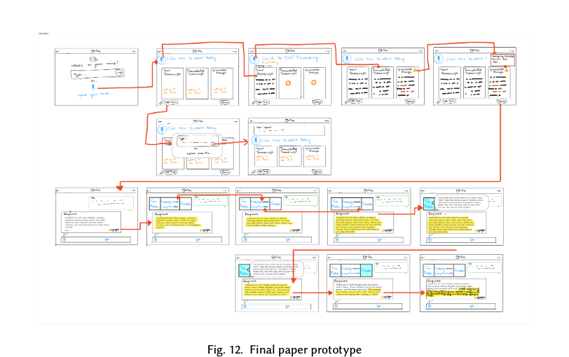
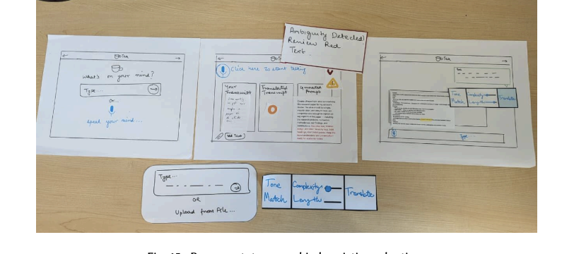
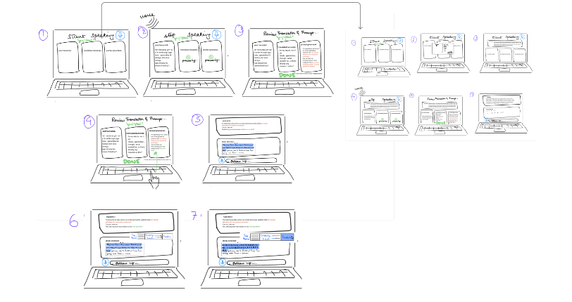
Before building anything functional, we Wizard-of-Oz'd the experience on paper. Hand-drawn laptop screens, sticky-note popups, and red-pen arrows laid out the full flow — voice entry, prompt review, response generation, and the highlight-based refinement menu — so we could walk evaluators through it screen-by-screen without writing a line of code.
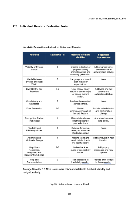
Five HCI experts — one per team member's prototype — walked through Nielsen's ten heuristics and rated each issue from 0 (no problem) to 4 (catastrophic). We followed the discount-usability principle: five expert evaluators is enough to surface roughly 75–80% of issues during low-fidelity work.
Evaluators · Tejas Maire (Sabrina) · Anthony Liao (Xinyu) · Anika Misra (Ishika) · Tomas Garcia Lavanchy (Marko) · + a fifth (Nina) · each session ~30 min
Each of the five of us authored an individual heuristic report against the same paper prototype. Mine averaged 1.3 severity across Nielsen's ten; the highest-severity issues were Error Prevention (2–3) and Recognition Rather Than Recall (1) — the same feedback / status gaps that surfaced in the simplified user testing. My two most concrete recommendations — “add a progress bar or animated cue,” “include a refresh button and confirmation dialogs” — both shipped in the hi-fi.
Evaluators couldn't tell when the prototype was recording, translating, or generating — leading to hesitation and re-tries. Status indicators became a baseline requirement in the hi-fi.
"Tone match," "rewrite," and "simplify" labels were ambiguous in the lo-fi. We tightened copy, gave each action a distinct icon, and demoed an example transformation inline.
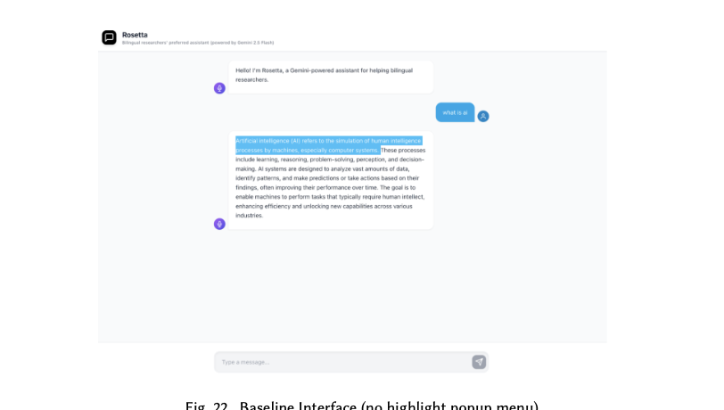
Several evaluators missed the highlight-popup entirely. The redesign added a gentle reminder under Rosetta's first message and a persistent "highlight text for tools" hint near the input.
No reliable undo for an applied transformation. The hi-fi returns each transformation as a new message that quotes the original snippet, so users can compare and discard freely.
Each team member ran one think-aloud Wizard-of-Oz session with a multilingual researcher pulled from their own network — five participants total, all drawn from our focus group of multilingual researchers using LLMs in their work. The shared goal was concrete: obtain a short bullet-point summary of a research paper to use in an upcoming presentation. We wizarded the paper prototype in real time and watched what they did when there was no facilitator to ask.
| ID | Role / background | Languages | Mode | Location |
|---|---|---|---|---|
| P1 | Financial law professor, 50, F | Native Macedonian; advanced English | Online | Participant's office |
| P2 | Software developer / researcher, 24, M | Native Hindi; fluent English (Hinglish in ideation) | Online | India |
| P3 | Statistics graduate student, 23, F | Bilingual Chinese and English | In-person | Leinweber |
| P4 | Predoctoral research fellow in business economics, 25, F | Fluent English; more comfortable in Chinese | In-person | Leinweber |
| P5 | Medical graduate student / researcher, 32, M | Native Burmese; English as secondary academic | In-person | Leinweber usability test lab |
Avg. session length · ~32 minutes
Almost every participant hesitated on entry, hunting for upload or input. One repeatedly clicked the arrow before muttering, “Ughh, where can I click… I'm clicking on the arrow.” Another asked, “Where can I give the paper?” The system lacked visibility for its primary actions.
“Tone match, length, translate… what???” One Hindi-speaking participant pointed out the AI output “is not casual” but couldn't find a way to fix it. Our terminology didn't match users' mental models, pushing them to re-prompt instead of using the controls we'd built.
Highlight was misread as a marking tool, not an action trigger: “I thought the highlight icon was just for marking text… Oh, it actually opens another window!” Others adjusted sliders and weren't sure anything had changed: “I can't tell whether it really changed the style.”
Bilingual participants kept toggling between English and their native language to verify translations. After a Macedonian summary, one said flatly: “These sentences are very poorly written… I'll rewrite them myself.” Cross-language consistency was costing more cognitive effort than the tool was saving.
I ran one of the five sessions with a medical graduate researcher who reads English journals daily. He went straight for voice input — “I prefer to speak because English words are hard to type fast” — then second-guessed whether the mic was actually recording. The English summary read clean to him but he asked if TEA could show a translated version in Burmese to verify. When “Ambiguity Detected” flashed up, he laughed: “Oh, the paper noticed my accent.” Three of my four observation notes from that session became hi-fi requirements: visible recording state, an explicit “Generating…” indicator, and a translation toggle the user controls.
Make feedback visible, make terminology legible. Real-time status (“Generating summary…”, “Simplifying output…”) during upload, slider, and translation. Concise tooltips and mini-examples for Tone Match, Complexity, and Length.
Give users control and a way back. Surface an undo / history for generated text, and make exit affordances in pop-up menus obvious. Cuts frustration and rebuilds the sense that the system is transparent.
Both recommendations directly shaped Rosetta: the popup tooltip anchors actions on the response itself (discoverability), and each transformation returns as a new message that quotes the original — control + history for free.
The heuristic evaluation + simplified user testing closed the loop. Three changes mattered most when we moved off paper and into a functional Gemini-backed web prototype.
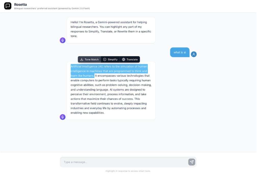
Rosetta sits on top of Gemini 2.5 Flash and looks like an ordinary chat assistant — until you highlight part of its reply. Three actions cover the moments the contextual inquiry surfaced most often: re-anchoring tone for a specific audience, simplifying dense academic language, and translating in place without losing the surrounding response.
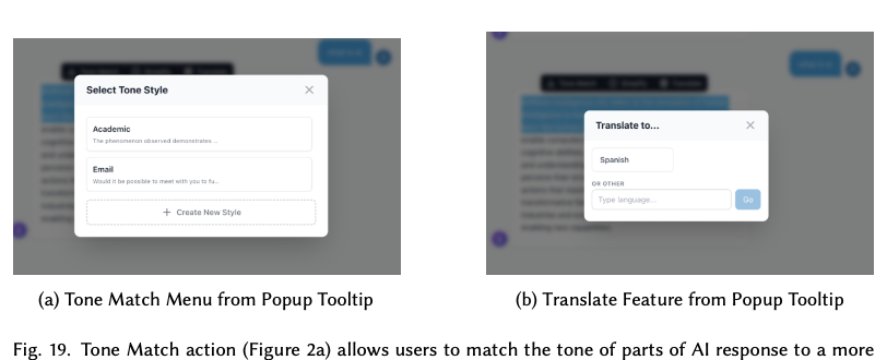
Re-anchor a passage against a preset (Academic, Email) or a custom style. Built from the contextual-inquiry observation that researchers constantly rewrite AI output for register.
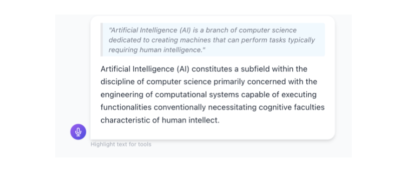
Reduce density without losing meaning — replacing the participant strategy of "ask again with simpler words" with a single click that keeps the original in view.
Translate any selection into the user's preferred language (or any other), without losing the surrounding English context they may still need for citation.
To answer R3 — does the popup tooltip actually reduce time and cognitive load — we ran a within-subject controlled experiment. Each participant performed two tasks in both conditions, counter-balanced to wash out ordering effects.
Within-subject, counterbalanced. Each participant used both the Baseline (no popup) and the Treatment (Rosetta with the popup tooltip) — in randomised order — for both tasks.
n = 15 recruited; G*Power calibrated to n ≥ 12 for a one-tailed Wilcoxon signed-rank test with α = 0.05, β = 0.2, and a large effect size (Cohen's d = 0.8). Participants were multilingual graduate researchers recruited across the team's academic networks.
Objective: task completion time (seconds), measured from instruction to verbal confirmation.
Subjective: NASA-TLX workload across mental demand, effort, frustration, and four other sub-scales.
Participants drafted a casual message to their PI ("Edit msg I want make agentic tool make auto lit review for wkly reading group") and adjusted Rosetta's reply to be appropriate for a professor — an authentic register-shift task pulled from contextual-inquiry observations.
Participants translated a specific paragraph of an AI-generated response into a language they were fluent in. Designed to measure whether in-place translation beats the participant strategy of pasting into a second tab.
Fifteen multilingual researchers, recruited across the team's networks. Together they covered eleven languages — Chinese, Mandarin, Cantonese, Hindi, Hungarian, Serbian, Croatian, Macedonian, Persian, Urdu, Punjabi — with English as either a primary academic language or a daily professional one.
| ID | Fluent in | Academic research language | LLM frequency |
|---|---|---|---|
| P1 | Chinese, English | Chinese | Weekly |
| P2 | Chinese, English | Chinese | Weekly |
| P3 | English, Mandarin, Cantonese | English, Mandarin | Daily |
| P4 | Hungarian | English | Weekly |
| P5 | English, Hindi | English | Weekly |
| P6 | Hindi, English | English | Daily |
| P7 | Mandarin | English (American) | Daily |
| P8 | Chinese | English | Rarely |
| P9 | Hindi, English | English (professional) | Daily |
| P10 | English, Serbian, Croatian, Macedonian | English | Daily |
| P11 | Macedonian, English | English | Daily |
| P12 | Persian, English | English | Daily |
| P13 | Urdu, Punjabi | English | Daily |
| P14 | Mandarin, English | English | Weekly |
| P15 | Multilingual researcher · anonymized | ||
Table 12 · anonymized + de-identified participant data
Across heuristic evaluation and the five Wizard-of-Oz sessions, participants gravitated toward fine-grained post-generation refinement rather than crafting longer prompts. They treated Rosetta's output as a draft — highlighting passages to retune tone or check translations — and switched languages most fluidly when the interface made the current mode obvious. The breakdowns were rarely about model capability; they were about knowing what the system would do next.
Equitable multilingual AI tooling doesn't need a new model. It needs interaction patterns that surface visibility, control, and a way back at the moment of edit: actions anchored to the response itself, transformations returned as new (quoted) messages so originals stay intact, and labels that match users' mental models instead of the team's internal vocabulary.
Participants preferred editing a specific passage in place over regenerating the whole response. The popup pattern — borrowed from interactions like Google Search's AI Overview — collapsed multi-step workarounds into a single click while leaving the original visible.
Bilingual researchers constantly verify translations across tabs. Making the active language and the transformation log explicit (each result quotes the source snippet) reduced the cognitive cost of that verification work.
Users wanted AI help and wanted to verify it. Returning each transformation as a new, comparable message — instead of mutating the original in place — acted as a free undo and a free audit trail, addressing the user-control heuristics that surfaced in evaluation.
Fifteen multilingual researchers (G*Power calibrated to n ≥ 12) completed both tasks in both conditions. Time was measured with a stopwatch; cognitive load with the NASA-TLX. Paired t-tests for time, Wilcoxon signed-rank for TLX — both one-tailed at α = 0.05.
| Task | Measure | Test | Statistic | p-value | Effect size |
|---|---|---|---|---|---|
| Tone adjustment | Time | Paired t-test | t = 2.09 | 0.0284 ★ | d = 0.56 |
| Tone adjustment | NASA-TLX | Wilcoxon | W = 81 | 0.0368 ★ | r = 0.48 |
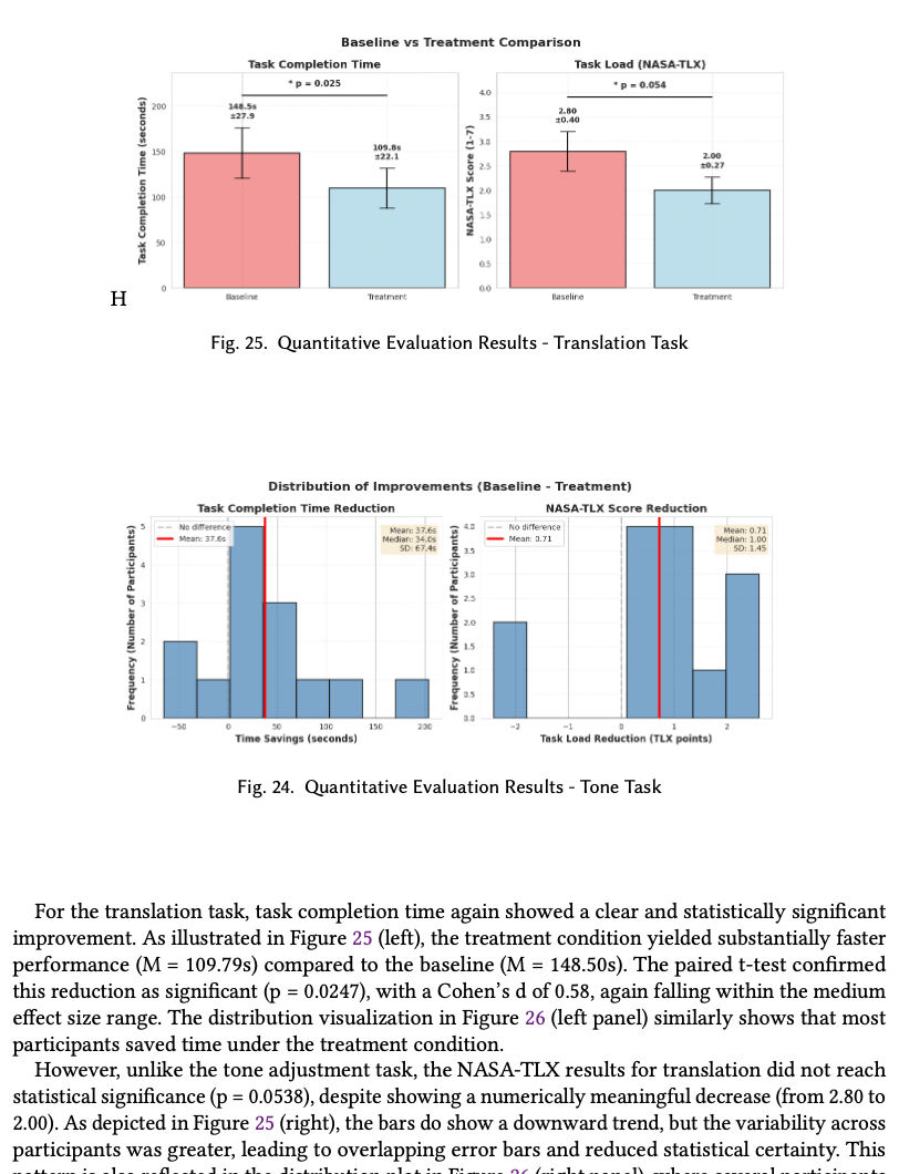
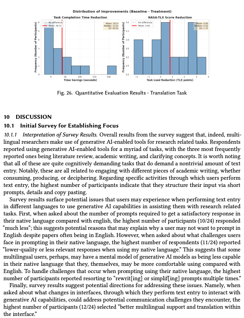
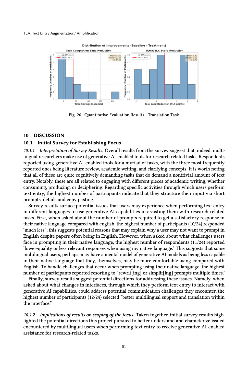
| Translation | Time | Paired t-test | t = 2.17 | 0.0247 ★ | d = 0.58 |
| Translation | NASA-TLX | Wilcoxon | W = 59.5 | 0.0538 | r = 0.43 |
★ = significant at α = 0.05 · medium effect sizes throughout
Treatment beat baseline on three of four measures at α = 0.05 with medium effect sizes. The fourth — translation NASA-TLX (p = 0.0538) — trended the same direction but missed significance, pointing to where additional recruitment would matter next.
Equity in AI tools doesn't always require retraining the model. Surfacing the right controls at the right moment can carry a surprising amount of weight on its own.
Five contextual inquiries gave us the workarounds. Heuristic + simplified user testing gave us the labels and discoverability fixes. A within-subject study gave us evidence skeptics would accept.
Users would rather refine a passage in place than rewrite the prompt. The popup tooltip codified a behavior the contextual inquiry had already shown us — it didn't invent one.
The single largest theme across heuristic eval and user testing was the same: people couldn't tell what the system would do next. Status, language, and labels are not garnish; they are the product.
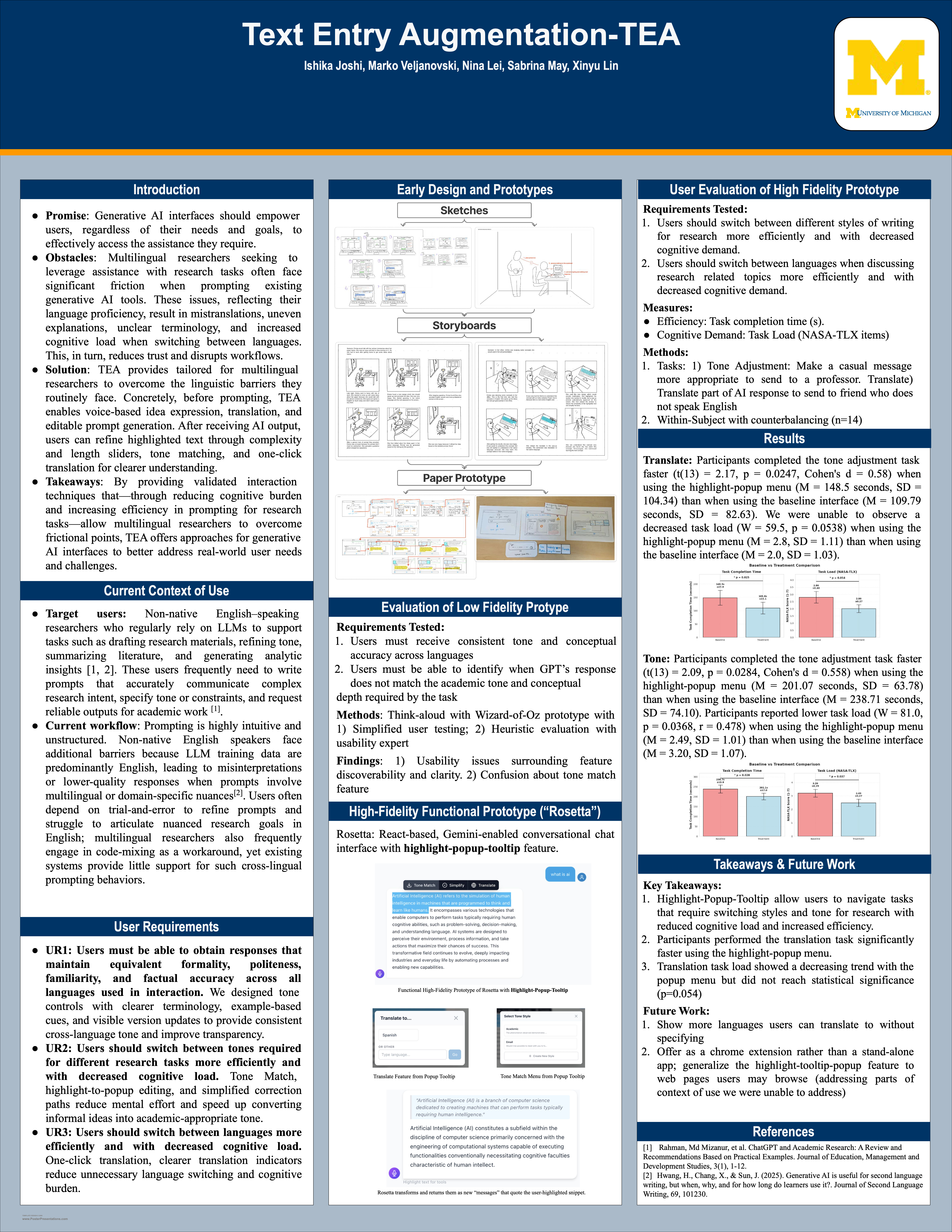
Presented at the University of Michigan EECS research poster session alongside a live demo of the Rosetta hi-fi prototype. The poster compressed our contextual inquiry, iterative evaluation, and quantitative results into one wall-sized take — designed to make the case in a 60-second hallway conversation.
Research paperThis project taught me that equity in AI isn't just about model fairness, it's about the entire interaction ecosystem. I learned to recognize my own assumptions as a native English speaker and to design from lived experiences that weren't my own. The moments when participants lit up because the system "understood" their language-switching patterns reinforced why user research matters. I also gained confidence in mixed-methods approaches: the qualitative insights gave us direction, while the quantitative validation gave us credibility. Looking back, I would have started contextual inquiry earlier in the process, as those observations surfaced nuances that surveys couldn't capture. This work has shaped how I think about inclusive design—not as accommodation, but as fundamental to good design.
All graduate HCI students at the University of Michigan School of Information and College of Engineering & Computer Science. Brought in different undergrad backgrounds and four native languages between us — which is part of why this project found us.
All authors contributed equally to this research. Conducted at the University of Michigan as part of CSE 593 (Fall 2025). Rosetta is a research prototype built on Gemini 2.5 Flash; the system, the survey instruments, and the evaluation protocol were designed and run by the five of us together.
All authors contributed equally to this research. Conducted at the University of Michigan, School of Information, Fall 2025. Rosetta is a research prototype built on Gemini 2.5 Flash.